Moneta Mobile
- Client
- Moneta Technologies
- Year
- 2023
- Category
- Fintech, B2B, Payments, Banking
- Status
- Live on Google Play Store
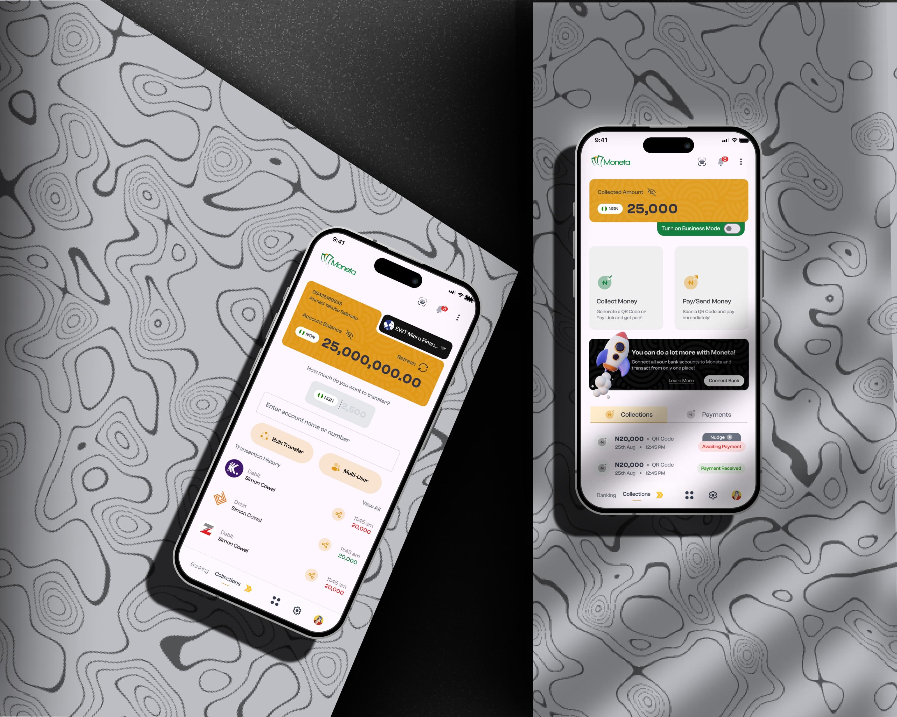
Overview
Moneta started as a web platform for payment collections. When the decision was made to bring the product to mobile, the challenge was not simply porting a web interface to a smaller screen. The mobile app had to serve two fundamentally different user types, merchants processing collections and individuals managing personal banking, on a single platform backed by two architecturally separate backend systems.
The Core Design Problem
The backend had collections and banking as two completely distinct systems, each with its own API architecture, data models, and compliance constraints. The product goal was for users to feel none of that separation. A merchant should be able to generate an invoice, receive payment, and move funds to their bank account without understanding that they have crossed a system boundary in the process.
This required going beyond standard UX practice. I spent significant time with the engineering team understanding the API responses and constraints at each integration point, mapping where user-facing friction was likely to emerge from backend limitations, and designing transitions that made system hand-offs invisible to the user.
Constraints
Three constraints had to be satisfied simultaneously, and they frequently pulled in different directions:
Technical feasibility: every design decision had to be achievable within the existing API structure and engineering capacity
Compliance: the app operates within CBN regulatory frameworks, which constrain how financial data is displayed, how consent is captured, and how transaction flows must be structured
Business objectives: the platform needed to compete with established players in both the collections and mobile banking space
The design process ran for three months and involved ongoing validation with shareholders across product, engineering, legal, and the business team. Design decisions that passed UX review were frequently revised when they hit a compliance or technical constraint.
Key Design Decisions
Unified navigation across two systems
Rather than separating collections and banking into distinct sections with separate navigation, I designed a unified information architecture where both capabilities were surfaced at the same level. The user never has to decide which mode they are in. The system routes the underlying transaction to the correct backend based on context.
QR and PayLink for merchant collections
Merchants needed a frictionless way to receive payment from customers. I designed a flow where merchants generate invoices that produce both a QR code and a PayLink. Customers with Moneta can complete payment by scanning or tapping the link, with pre-connected bank accounts removing the need to re-enter payment details at the point of transaction.
POS extension
The design architecture was later extended to support a POS application. The fact that the mobile app could be adapted for point-of-sale use without a significant redesign was a direct result of designing the underlying system to be modular from the start.
Outcomes
Over 250,000 merchants onboarded to the platform
Integrated with 12 microfinance banks, with further integrations in planning at the time of departure
Live on Google Play Store with over 1,000 downloads
Design architecture extended to a POS application without requiring a structural redesign